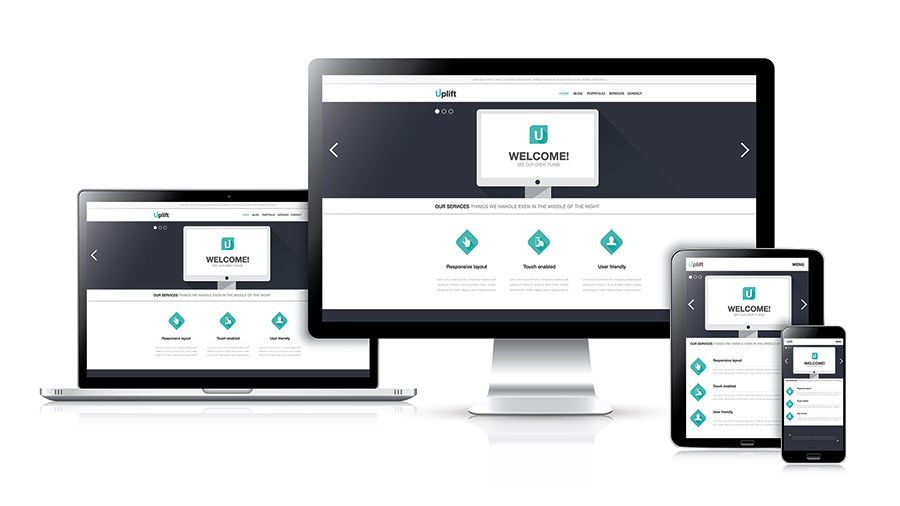
Recently I spoke at a Tele-Summit on the subject of responsive web design, and during my interview with Gloria Rand, an Internet Marketing Expert & Naples SEO Copywriter, I shared some important web design tips that are critical for engaging and converting leads and customers. Although I spoke largely on the subject of responsive web design, I included a great deal of important information about web design, regardless of the device where the site is being viewed. Here are some of the major web design points I covered:
Web Design Impacts Leads, Opt-ins and Sales Conversions on a Subconscious Level
Buying decisions are made at a subconscious level. Whether design is for a website, brochure, or a store, it will have a dramatic effect on the customer experience and what the customer does. There are always exceptions – like stores with a strong brand and sites like Craigslist where it can look like an eyesore and people will still stick around. Most of us have done a search and found a site in top search results that was atrocious and had very little relevant content to our search. We couldn’t get off the site fast enough. While website traffic will not necessarily be affected by design, most often conversions will.
Design is Important Everywhere Both Online and Offline.
Let’s say you’re invited to a party – a good friend took you there and you walk into a room full of clutter and disorganization. How does that make you feel? Most likely you will feel anxious and stressed. You may not realize it on a conscious level, but you will not feel comfortable in that room. But if you walk into an environment that is neat, clean, organized, and beautiful, you are likely to feel welcomed and comfortable. Your subconscious mind will put you at ease. You are more likely to stay and be receptive to the experience in that environment.
Retailers know how important design is to new and repeat customer business in a brick-and-mortar store. In a store with a good design, hot sellers are in the front of the store and on the ends of the aisles where they will be seen. Signage tells you where categories of items are located. If the aisles are spacious and it’s easy to move around, this will make you enjoy shopping in that store.
A clean, organized website with good content works the same way. Good web design Naples is critical for a positive visitor experience. The visitor is much more likely to stick around on a page that is professional, beautifully designed, where content is not crammed together, and where it is easy to find important information that is easy to view. Lack of balanced content can subconsciously and negatively affect the visitor experience. Too little space or too much space between content elements can be a distraction. Visitors will not perceive this on a conscious level – but they will likely respond because of the subconscious messages that are making their experience less than desirable. And off they go to the next site.
Changes in Rules for Web Design Because of Responsive Design
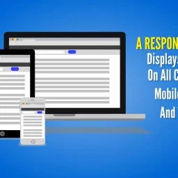
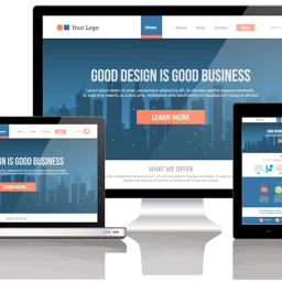
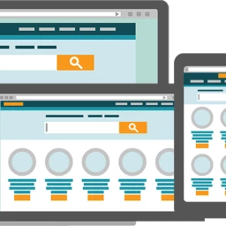
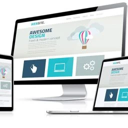
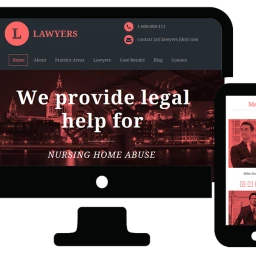
In a mobile device, particularly a smartphone, not much content fits above the fold before you scroll. The main rule for responsive design is that the site should display well on all screen resolutions, browsers and devices including smartphones and tablets in both vertical and horizontal orientations. Here are a few more considerations:
- Important content should be close to the top.
- Content should be relatively balanced with ample and equal space around content elements.
- When the site is viewed on a desktop and it has a background color or image, there should be a contrast between the background and the foreground where the content is viewed. This draws your eye to the page region where important content is viewed.
- Content should be on a white or very light background. A white font on a black background is difficult to read and hard on the eyes.
- If there is a background image, it should be absent or minimal on a phone and tablet.
- Color and artwork are important considerations. Some colors are offensive to some cultures. Certain colors are better for some industries. Blue and gray are common corporate colors whereas pizza restaurants are almost always red and yellow. Health colors and the environment are primarily in the green colors. Shades of colors can also make a significant difference to the visitor’s experience.
Effective Content Elements, Layout and Formatting are Essential for Good Web Design
- Headlines must rapidly relate what the page is about and who it is for.
- Logos should display well on every device and should coordinate with the color scheme of the site.
- Emotionally compelling graphics that are a metaphor for the main benefit is more effective than video in the header.
- Sliders that effectively and attractively communicate the main points can be very valuable for engaging the right audience in the right message.
- Formatting and elements on the page should minimize scrolling. This is where collapsible toggles for FAQs and content within tabs can be useful on every device.
- Most importantly, content has to be compelling.
Basic rules for producing conversions on a website or landing page:
Design and content are critical for conversions. Whether your content is for print media, video scripting, a blog post, or website pages it should be engaging, targeted, concise, grammatically correct, free of errors, and properly formatted. In addition, here are some basic but very important conversion strategies for standalone landing pages or sales and landing pages within a website.
- Each page should be created with a single purpose or conversion goal. The purpose may be to get an opt-in subscriber to an email list, to request an appointment or quote, to purchase a product or service or to complete a survey or registration form. One of the biggest mistakes businesses make online is to include multiple conversion goals on the same page. This confuses the visitor. A confused visitor seldom becomes a customer. This is where strategy becomes important. Let’s say we have a landing page with a purpose to get a quote.
- The content has to hook the visitor right away. It should keep them engaged and wanting more. It should educate them, answering all their objections. It should provide social proof in the form of testimonials and conclude with a single no risk offer. There should be a reason to act right away.
- Conversion goals should be based on a strategic plan. If the goal is to get the visitor to fill out an inquiry form and become a lead, instead of presenting a plain thank you message when the lead is obtained, redirect the visitor to a page where you provide some incentive and get them to opt-in to your email list. An exit website strategy can be used to produce a conversion for the visitor who does not convert and closes the page. This visitor can be redirected to a popup window that presents them with an enticement to opt-in to your list. In this way, the visitor is presented with only one clear conversion goal at a time and it is relevant to the actions that they take.
Hopefully you learned quite a bit about web design for achieving success online. If you have questions or comments, you are invited to enter them below.
Need Some Help with Your Online or Offline Marketing?
If you are ready to take your business to the next level, then please request this 30-minute consultation, personally conducted by me, Ruth Kuttler, the director and project strategist for Webpuzzlemaster. For more than a decade, I have helped many types of companies to improve their marketing results. This custom strategic marketing session will be prepared for you based on an analysis of your current online presence and your top three competitors. You will learn how you compare to your competitors, strategies they are using to achieve market domination, and what you can do to more than exceed their results. There is no charge for this call, but the call must be strictly limited to 30 minutes.
Request a Free Consultation
Whether you are a local business, entrepreneur, attorney, healthcare provider, or eCommerce merchant, we have digital marketing skills and strategies to help your business succeed. Ask us how we can help you through responsive website design and development, video, social media, and marketing services that engage, convert, and grow your brand and revenues. Our consultations are free and available through phone and screen sharing. Contact us now by clicking the button below.


