
What is responsive web design and why is it important?
Responsive web design is the best solution for reaching a mobile market. Before I explain what it is, it is important to talk about a trend in which an overwhelming majority of people are exclusively using a mobile device – their smartphone predominantly and also tablets to a lesser degree, to exclusively access the internet.
This trend for using mobile devices to access the internet is getting stronger every day. Over 70% of all users are finding websites, using apps and engaging in social media, banking, shopping, finding locations via GPS, calling merchants and more through their phone and tablet. More than 50% of those users are exclusively using their phone.
Ignoring this trend by not having a mobile friendly website, will definitely put a business at a huge disadvantage as visitors will find companies and do business with those who have adapted – they will not stick around on a website when they have to scroll to the right, stretch out content and struggle to fill out forms.
Apps are fine but they do not replace your website either. Most apps are designed with limited functionality and they link the visitor over to the website for them to access important information that is not available on the app. Management of content on an app is also limited.
A good website is the hallmark of professionalism and it creates a subconscious message that the company with a good website is probably a quality company to do business with. If you send people to a website that is old school, looks unprofessional and is not mobile friendly, it conveys that your company is not professional and not to be trusted. It’s all about your image – your brand.
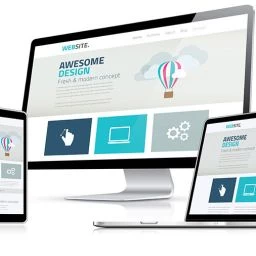
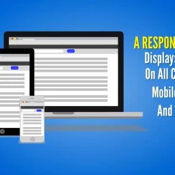
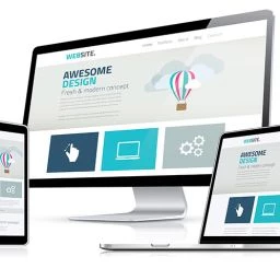
Responsive web design provides the user with an optimum display of all of the website content on every device whether they are on a desktop with a large monitor, a small laptop, tablet or smartphone. It automatically adjusts the display of contents from the menu to formatting of contents. For example, on a desktop, content in 4 columns will likely display in 2 columns in a vertical tablet view and display in one column in a phone vertical and horizontal view. The menu on mobile devices is likely to automatically become a dropdown menu.


This means that all content in a responsive design is very readable and easy to access. From filling out forms to viewing a video or image, joining an email list, getting search results, reading news or blog information, taking online training, or buying a product – all of this is presented as an optimum experience on every device where it is viewed. And all the information on your site is available.
What is a mobile design?
A mobile design or mobile conversion creates an alternate version of your site. it is not the same as a responsive design and is associated with four main problems:
- Software used for this conversion will not capture all the content from your existing site. This means that important information such as child pages, shopping carts, calendars, and call-to-action buttons, forms and search functionality may be omitted. The user is prompted to visit the main site (not mobile friendly) for accessing this type of content.
- When new content is added to your main site, if this is to be available on the mobile site, it need to be manually added. Similarly, outdated content will need to be manually removed from your mobile site. This requires management of two separate projects instead of a single mobile friendly website version.
- Mobile sites are not indexed by Google. If a mobile site is all you have, your site will not be available from searches in Google.
- Content from mobile websites is not visually appealing for tablet users. Tablets are often close in size to laptops, and a mobile display often leaves big empty spaces and other formatting issues that are unattractive.
Responsive website design outperforms mobile web conversions in many ways.
Not only does this provide an optimum viewing, reading and buying experience, it includes all elements and content from your website with some minor formatting differences. Navigation for instance, may be available from a drop down menu instead of the top level links that display on a larger device. Columns will readjust to fit the device. Forms are easy to complete. Search functionality and eCommerce work just as well as they do on a desktop. There is only one website to maintain, and the site is indexed by Google and available in search results for all users.
Responsive design however is not the only factor in making a site appealing and effective.
A website can only be as good as its content, navigation and formatting. The best responsive web design will not make up for problems where the content is poorly organized, not engaging, poorly written and lacking in formatting for viewing and readability. I have seen responsive design where the content had no headlines, sub headings, had pages in the navigation that barely had anything on them and truly served no purpose, and pages where the content had no formatting and went on and on. I have seen responsive sites where some content wasn’t responsive and where menus were covered up by images. What I’m trying to say is that there are all different qualities of web design and development whether it is responsive or not.
Need Some Help with Your Website Design and Development?
If you are ready to take your business to the next level, then please request this 30 minute consultation, personally conducted by me, Ruth Kuttler, the director and project strategist for WebPuzzleMaster. For more than a decade, I have helped many types of companies to improve their marketing results. Please be assured that this consultation will not be limited to a discussion of website design and development. It will provide you with a strategic marketing plan based on an analysis of your current online presence and your top three competitors. This powerful session will show how you compare to your competitors, strategies they are using to achieve market domination and what you can do to more than exceed their results. There is no charge for this call, but the call must be strictly limited to 30 minutes.
Let us provide you with a free analysis of your online presence.
This strategic marketing consultation with competitor analysis is provided free of charge. If you are looking for a detailed plan to capture market share, dominate your market and produce sustainable business growth, request this free consultation.
Request a Free Consultation
Whether you are a local business, entrepreneur, attorney, healthcare provider, or eCommerce merchant, we have digital marketing skills and strategies to help your business succeed. Ask us how we can help you through responsive website design and development, video, social media, and marketing services that engage, convert, and grow your brand and revenues. Our consultations are free and available through phone and screen sharing. Contact us now by clicking the button below.