Perhaps you’re not aware of the trend for more users to exclusively access the internet through a mobile device – upwards of 70% of all internet users are finding attorneys on a smartphone or tablet and most of those are phone users. Whether your niche is bankruptcy, criminal defense, estate planning, personal injury, real estate or wrongful death law, you have the potential to dominate your competition with strategies that give you access to an exploding mobile market.
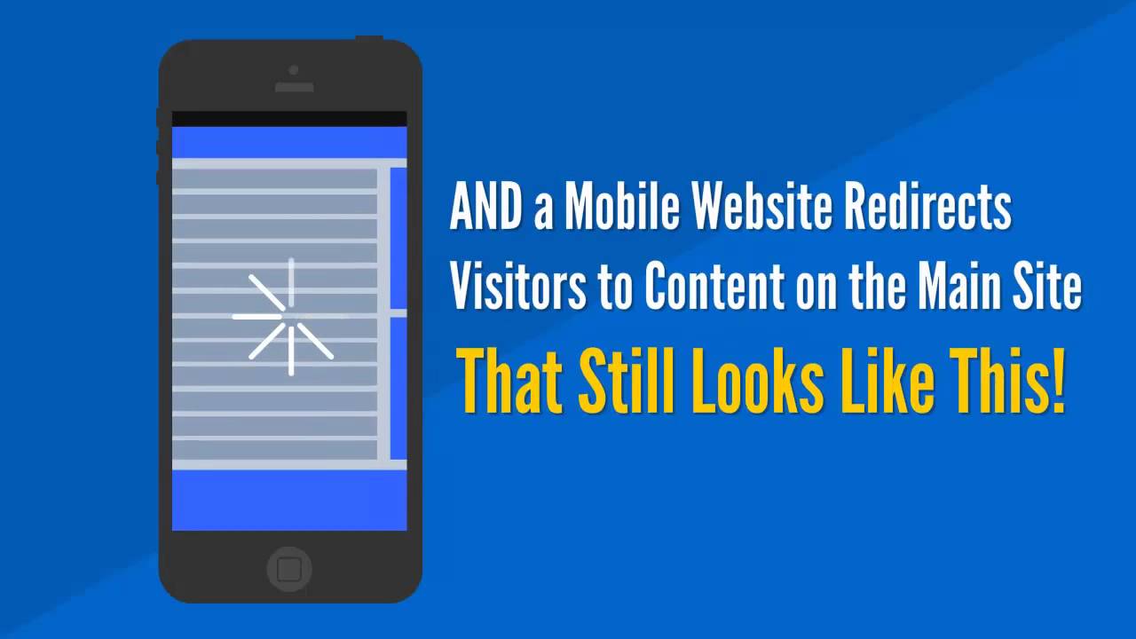

If you haven’t been already, you can expect to be approached by web development companies whose mission is to convince you that attorney mobile websites are your best option for effectively reaching this market. They may even offer to build you a beautiful desktop site where the bulk of your content will be available – then when a mobile user wants more information from the mobile website, they are given an option to click over to the desktop site where they will struggle to read and view your content. Unfortunately, if you go along with this approach, you will have two sites to manage and your mobile site which is not indexed by Google, will ultimately cost you leads, clients, time and money.
Five Problems Associated with Mobile Websites
A mobile design or mobile conversion creates an alternate version of your site. it is not the same as a responsive design and is associated with four main problems:
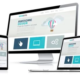
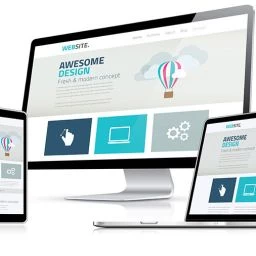
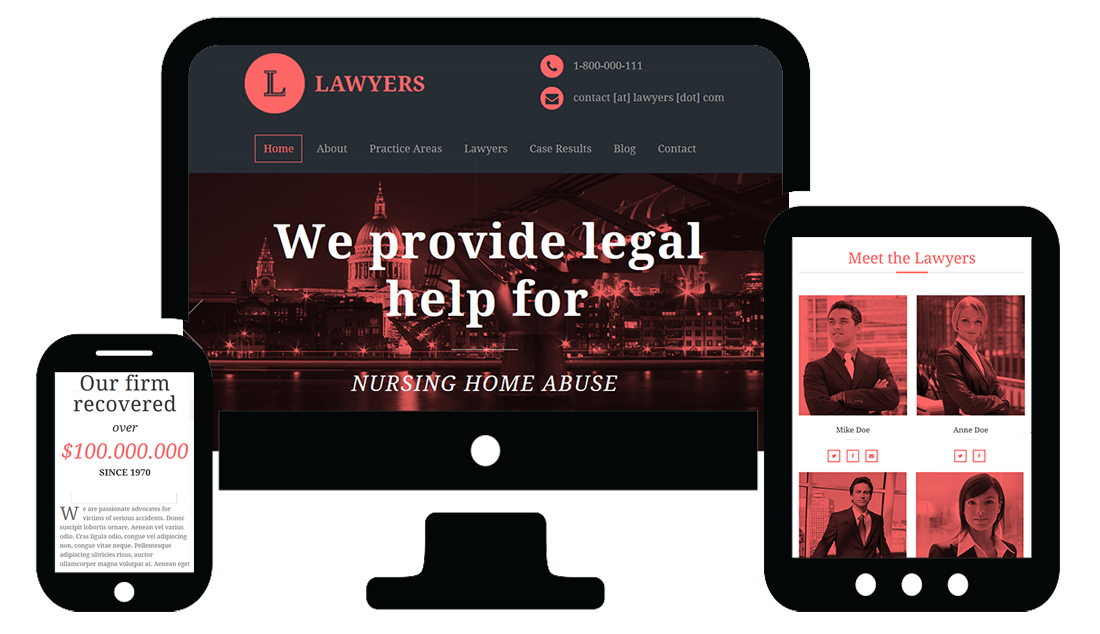
Responsive Web Design is the Only Acceptable Type of Mobile Design to Use.
Not only does responsive web design provide an optimum viewing, reading and buying experience, it includes all elements and content from your website with some minor formatting differences. Navigation for instance, may be available from a drop down menu instead of the top level links that display on a larger device. Columns will readjust to fit the device. Forms are easy to complete. Search functionality and eCommerce work just as well as they do on a desktop. Content can be hidden for desktop and mobile devices, making the display extremely versatile for all types of users. There is only one website to maintain, and the site is indexed by Google and available in search results for all users.
Responsive web design gets your site indexed by Google and for that reason alone, it outperforms mobile websites for lead generation, client acquisition and sustainable growth of you law practice.
What Would a Detailed Analysis of Your Online Presence with a Plan for Generating High Quality Attorney Leads in Your Area and Practice Area(s), and a Substantial ROI Be Worth to You?
Request a Free Consultation
Whether you’re an attorney in your own practice or a partner in a large law firm, we have digital marketing skills and strategies to help your business succeed. Regardless of your practice area and degree of competition, we can help you through responsive website design and development, video, social media, and marketing services that engage, convert, and grow your brand and revenues. Our consultations are free and available through phone and screen sharing. Contact us now by clicking the button below.