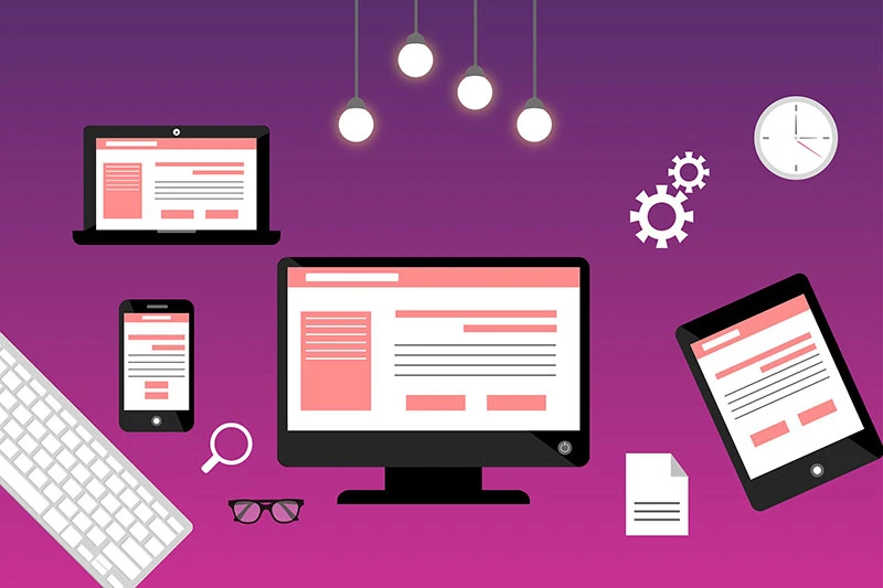
What is the Visitor Viewing on Your Website?
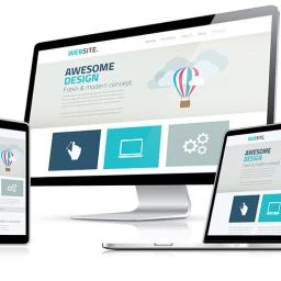
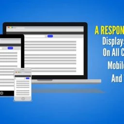
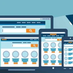
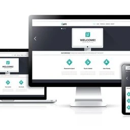
Do you know what your website looks like on all devices? Does content add or detract from the user’s experience on a mobile device where most of your market spends their time?
How your website displays on a desktop, laptop, iPad, and iPad pro will determine whether your visitor has a meaningful and logical presentation of your content or leaves them less than impressed. The lack of appealing, balanced content in the right order can greatly diminish the user’s experience and interest in staying on the website.
In this post which is a continuation of “Is Responsive Web Design Per Google Overrated? How to Make Your Website Design Profitable,” we will explore 3 of the most important web design factors for achieving a good responsive website design that engages targeted traffic and converts visitors into leads and customers.
Good Web Design Appeals to Your Customer's Subconscious Mind
Did you know that you experience your world and make immediate value judgments largely from your subconscious mind? Apart from your conscious mind where deliberate choices are made, the subconscious mind allows you to reject on autopilot, a massive bombardment of information that is constantly competing for your attention.
Your subconscious mind is very powerful. It works 24/7, even when you sleep, and filters what you see and hear. When it detects something that resonates with your values, beliefs, and what you like, it may get and keep your attention. When it doesn’t, it rejects the thought or idea without your conscious awareness. If you’re repeatedly inundated with the same information, the message may break through and enter your conscious mind where you can choose whether to give it your attention. This is how interruption forms of advertising typically work.
Websites receive traffic from multiple sources. Because traffic is generally from a link of interest to the user, it is easier to break through the user’s subconscious filters. The website is where most conversions take place. That might be opting into a list, booking an appointment, buying a product, downloading a white paper, or registering for an event.
Good design matters most on a website where with a single click, the user stays or leaves the site, never to return. Capturing and keeping the visitor’s attention, is not an easy task, even when the user’s subconscious mind is giving the okay signal to proceed. You have just a few seconds to engage the visitor or lose them forever. Engagement and interactivity demand an optimum experience from whatever device the website is being viewed and browsed. In this day and age, the mobile experience is by far, the one that is most important for capturing and retaining ideal customers from your market.
The 3 Most Important Factors in a Good Responsive Web Design: Adjustment, Organization, and Quality
ADJUSTMENT: This refers to the display of content in all devices including mobile horizontal and vertical orientations. How does the content adjust to the device? Are there appropriate font sizes, line height for text wrapping, and spacing around content elements? Are there big spaces where content is poorly balanced? Are some content areas overlapping others, or is some content only available by scrolling to the right?
ORGANIZATION: View the organization of content on all devices and views. Is the content arranged to display in the correct order that is logical for the user’s experience on all devices? Is the most important content above the fold before scrolling? Does the content conclude with a no-risk call to action and incentives to act without delay?
QUALITY: View the quality of content. Is it free of spelling and grammatical errors? Is it engaging, interesting, and compelling? Does it speak to the ideal customer and tug at their heartstrings with a feeling that you offer the perfect solution to their problem? Even if it does, is text content broken up or formatted to hold the visitor’s attention? Perhaps that is accomplished with captivating images, video, headlines, sub-headlines, icons, teaser content, and collapsible elements.
Then there is the importance of colors in the Logo and Graphic Design Services Florida. Colors can have a significant impact on the industry being targeted. Colors must also coordinate well with the logo. Finally, font sizes and styles should enhance the design and readability of text content.
Factor #1: Adjustment for Responsive Web Design
Problems with adjustment are often present in mobile devices. Typical adjustment problems include column layout of content, font styles, and padding around content elements. It is always best to evaluate design with an actual mobile device as browser simulators that most web developers rely on, can be inaccurate. Changing the iPad from a vertical to a horizontal orientation will allow you to view and evaluate the iPad Pro.
Column layout problems are most often present in the iPad and iPad Pro. A four-column layout on a desktop or laptop may look just fine on an iPad Pro but then again, it may compress content, distorting the appearance of rows where the content should be equal and balanced. In some cases, iPad Pro content may adjust from four to two columns leaving a small image or video on one side and a massive amount of text on the other. Sometimes, the middle alignment of a row can correct mobile adjustment issues. But more often, iPad views are unacceptable without styling corrections via CSS, cascading style sheets. Displays with 2 and 3 columns in a row may need to be changed to a single column layout.
Header artwork, images, and embedded video should adjust in size for the mobile device. Adjustment should never produce undesirable spaces around the perimeter of content. Left and right margins should be appropriate for the device to allow for some padding but not so much as to impact the design or diminish the content.
Logos and fonts may also need adjustment. The logo should be an appropriate size with sufficient padding for the mobile device. When it comes to fonts, font sizes and line heights should adjust for better display and readability. Some WordPress themes include settings for mobile logos and adjustment of font size and line height. But more often, these styles require custom CSS.
Factor #2: Organization of Content in Your Website Design
An important factor for the user experience is organization of content. This means that content should be displayed in the correct order on all devices. This will ensure that the presentation sequence is meaningful and logical. Logical order of content may include a header image, followed by a headline opening and descriptive text that defines the main problem for the particular market that you are targeting. Opening with a question or strong comment with an emotional component can hook the visitor and peak their interest in wanting to know more.
The order and type of content should be based on the purpose of the page. This might be sales, marketing, new product launches, information, education, or entertainment. A Content Copywriting Service and Professional Digital Content Development Agency can help you create the type of compelling content and layout to keep your visitors engaged and get them to take action.
When it comes to organization and mobile devices, problems with the order of content are particularly important to check. It may not be too much of an issue on a desktop or web TV if a video is on the left and the teaser content is on the right. But on a tablet or phone, the video will display on top of the teaser content – not terribly desirable if you want to motivate the user to watch the video. Regardless of the type of content, you will want it to display logically and balanced on all devices, particularly tablets where adjustments are commonly needed.
Factor #3: Quality of Content in Your Website Design
Quality pertains to a coordinated and aesthetically pleasing design and layout of pages, posts, footer, and content with an optimum responsive display for mobile devices. The copy should be free of spelling and grammatical errors. Content should be engaging, interesting, and compelling. It should speak to the ideal customer, making it clear that you understand their problem, have the perfect solution without risk, and are a company they can trust. Perhaps that is accomplished with captivating images, video, headlines, sub-headlines, icons, teaser content, and collapsible elements. An appropriate call to action should always be included as the closing content. This may be a button linked to an inquiry or email opt-in form, or a link to buy a product or register for an event. Links to external content should always open in a new window to return the user to the website when they close the linked page.
Colors in the design and logo can have a significant impact on the industry being targeted. Design colors should coordinate well with the logo. Finally, font sizes and styles should enhance the design and readability of text content.
A Final Comment on Good Web Design
Quality of the web design encompasses adjustment, organization, graphic design and content. The 3 attributes described in this post for good responsive web design are essential for achieving a powerful connection with the user’s subconscious mind – one where they are more likely to become engaged, explore the content, and convert to a lead or customer.
Choosing a Web Design and Development Company
A good Responsive Web Design Agency in Florida will analyze the design of all types of devices. They will use CSS to adjust columns, padding, and font styles to optimally display content based on the device. This can greatly enhance the user’s experience and interest in staying on the website.
The difference in quality between one responsive web design company and another cannot be overstated. Most BTB and BTC customers are on their phones most of the time. Some exclusively use their phone to browse the internet and make buying decisions. When a website design does not display properly on a phone or tablet, it may leave the visitor feeling frustrated and distrustful of the merchant. Often a negative user experience is their reason for leaving the site.
We invite you to request a free consultation from Webpuzzlemaster Digital Marketing Agency with a complementary website analysis. This will be an informative session without any pressure to analyze the quality of your website and provide suggestions for improvement if indicated. We may also reveal some strategies that will allow you to outperform your competitors, regardless of industry or competition.

Two Valuable Local Business Marketing Reports:
(1) How to Get and Stay Ahead of Your Competition in Any Local Market: 8 Strategies for Local Business Success Regardless of Industry and
(2) What Local Businesses and Professionals Must Know About Video Ranking to Get & Stay Ahead of their Competition. This report reveals YouTube production and marketing video strategies that will rank your videos on top of Google and YouTube search results – getting you views, clicks, subscribers, shares, and traffic!