Gone are the days when the value of a quality professional website was uncertain. Yet many businesses are still holding on to an old static website that is seldom if ever updated, lacks interactive elements, and does not offer a mobile friendly user experience. What these businesses don’t realize is that clicks to their website are producing clicks off their website and onto a competitor’s site that is mobile friendly. The result is a serious loss of market share.
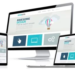
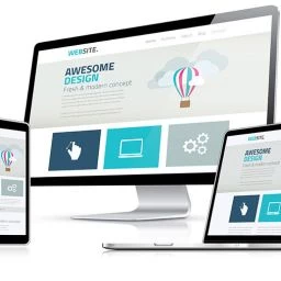
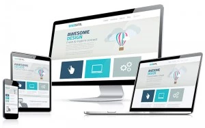 If you want your website to rank in Google and have more people find you through search marketing, then having a quality mobile friendly website is an absolute necessity. What you are about to learn is how and why responsive website design is the best way to achieve an effective mobile friendly website and provide an engaging and high converting mobile friendly user experience.
Google is the biggest and most important search engine, driving traffic to merchants and professionals through Google ads, websites, blogs, images, video, social media, and map and directory listings. Google’s algorithms are constantly changing and based on trends. The trend for internet use from mobile devices gets stronger by the day. Over 70% of customers are searching, browsing, getting driving directions, banking, shopping, engaging in social media, sending email, texting and making phone calls with the click of a button on their phone and tablet.
Below are 10 important reasons why a Responsive Website Design is your best option for effectively reaching your market in today’s internet.
1. Google favors responsive websites for SEO.
A well optimized mobile friendly site will boost your rankings in organic search results. Google prefers responsive web design over mobile templates. A single URL makes it easier for Google bot to crawl your site. It also reduces the chance of on-page SEO errors. When SEO is a core component of a digital marketing strategy, having a mobile–friendly website that is properly indexed by Google is essential. Since mobile customers are more likely to be searching for local information, mobile-specific keywords can easily be incorporated into a responsively designed website.
2. Most internet users today are tech-savvy.
These users rely primarily on their mobile device for all of their internet needs. About 70% use phones and tablets to access the internet. Of those, 55% are using their smartphones exclusively. These numbers are expected to grow. Interacting with websites on smartphones and tablets is not the same as desktop and laptop computer monitors. Responsive design integrates technology that adapts for click versus touch, screen size, resolution, support for Adobe’s flash technology, optimized markup and others.
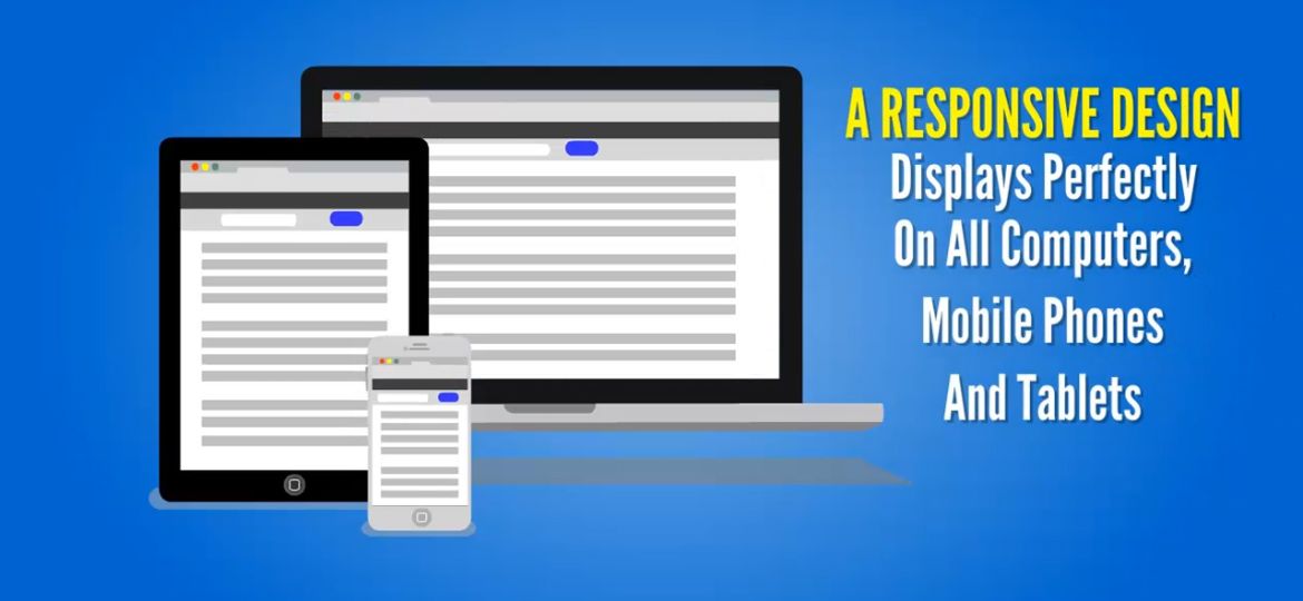
3. Responsive website design provides an optimum mobile friendly user experience.
Through a single website, your contents from text to images, video, calendars, eCommerce, forms, menus, tabs, toggles and other elements, automatically adjust in layout when viewed on phones, tablets, laptops and desktops. For example, content in four columns on a desktop will likely display in 2 columns in a vertical tablet view and display in one column in a phone vertical and horizontal view. The menu on mobile devices generally displays as a drop-down.
4. Well designed responsive websites have a faster loading time than traditional data driven websites.
Load times are important to Google as well as users who want fast easy access to the information. When their experience is slow, they are more likely to leave the site and never return.
 5. Responsive websites keep visitors on your site longer and decrease bounce rates.
 5. Responsive websites keep visitors on your site longer and decrease bounce rates.
Design matters a great deal and buying behavior is largely based on the visitor’s subconscious mind. Whether the customer is viewing a website or shopping in a retail store, the visual appeal of the building, merchandise, signage and lighting will determine whether the customer remains, browses, buys, returns to buy more and tells their friends. This is why retailers invest in a storefront and a shopping experience that is easy and pleasing to the shopper. Walk into a Walmart and you will see advertised specials at the front, clearly labeled isles grouped with similar merchandise, plenty of room between the isles and easy checkout with extras that entice buyers to add to their purchase. Responsive website design with the right organization and presentation of content provides a layout that lets your website sell like a Walmart store.
6. Responsive websites have a 21-24% higher click-through-rate compared to traditional non mobile friendly sites or mobile website versions.
A mobile design is an alternate version of your site and is associated with three major problems. Besides having to maintain a separate version of your site, a mobile website is not automatically indexed by Google and does not appear in search results. This reduces Google rankings and access to 70% of people who are searching from mobile devices. The second problem is that content from mobile websites is not visually appealing for tablet users. Tablets are often close in size to laptops, and a mobile display often leaves big empty spaces and other formatting issues that are unattractive. The third and biggest problem is that mobile websites contain limited content and prompt the visitor to click to the main site (a non mobile friendly website) for more information. There’s a 61% chance that the user who doesn’t get access to what they want right away will leave immediately and go to another website (most likely a competitor).
7. With a single URL for visitors on any device, you have a powerful platform that can save marketing dollars.
With one responsive site used for your digital marketing campaign, you can increase your brand and reputation with Google and acquire more social shares at a much lower cost. There is no need to optimize and market a separate mobile version of your website.
8. Google now allows you to track phone calls in Google Analytics.
This provides a measurable conversion strategy that is ideal for click to call functions by mobile users.
9. A responsive website is easier to manage.
Instead of two sites – a site for desktop, laptop and web TV customers; and a mobile site requiring separate management, responsive design means that only one site requires management. This also makes responsive design more cost effective for upkeep and marketing.
10. Responsive website design does not limit the type or amount of content that can be made available to the user.
Unlike a mobile website with limited content, responsive design does not frustrate the visitor who needs or desires more information for making an informed decision or completing a specific action. The user experience can be improved on different devices by disabling, enabling or re-positioning elements. Besides engaging content and functionality, responsive design offers an interactive experience and options for a secure and private online environment. A good responsive design will present content in a balanced and logical order on all devices for conversion purposes.
These 10 reasons are why we at WebPuzzleMaster specialize in developing responsive websites for local businesses and entrepreneurs.
It is also important to understand that not all responsive website design is of the same quality. And unlike buying an automobile to get the best price and service, web design and development is highly dependent on the skill and strategies of the web development company. If the quality of the site and content is not optimum, is it unlikely that even a high traffic site will convert into leads and customers, grow a company brand and result in social sharing. Our one stop web design, development, branding and marketing is designed to get you the results you desire at a significant return on your investment.
Request a Free Consultation
Whether you are a local business, entrepreneur, attorney, healthcare provider, or eCommerce merchant, we have digital marketing skills and strategies to help your business succeed. Ask us how we can help you through responsive web design and development and other digital marketing services that engage, convert, and grow your brand and revenues. Our consultations are free and available through phone and screen sharing. Contact us now by clicking the button below.